Online Doctor Consultation
How I designed a service where the law prohibits half of what users expect from “seeing a doctor online”.
CLIENT
Clinic
segment
B2C
Industry
Telemedicine

Context
Telemedicine in Russia is regulated by Federal Law — and this law work very differently from how most people picture “seeing a doctor online.” A doctor cannot make an initial diagnosis remotely. They cannot prescribe treatment from scratch. Adjusting therapy or renewing a prescription is only available to a patient who has already had an in-person visit with that doctor.
I designed an online consultation service for a private medical network's app — aimed not at acquiring new patients, but at the goal the industry's business model actually calls for: retaining and serving patients who are already in the system. This isn't “Zoom with a doctor” — it's a tool for people who are already clinic patients.
My Role
01 UX/UI Designer
02 Product Research
03 End-to-end design, from discovery to screens
Tools
01 Figma
02 Problem interviews
03 Competitive analysis
The Problem
“A user wants to get a diagnosis online. The law forbids it. How do you design a service that's honest with the patient without disappointing them on the very first screen?”
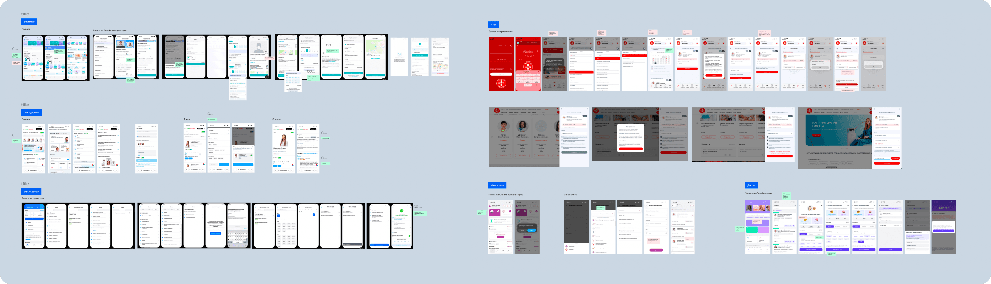
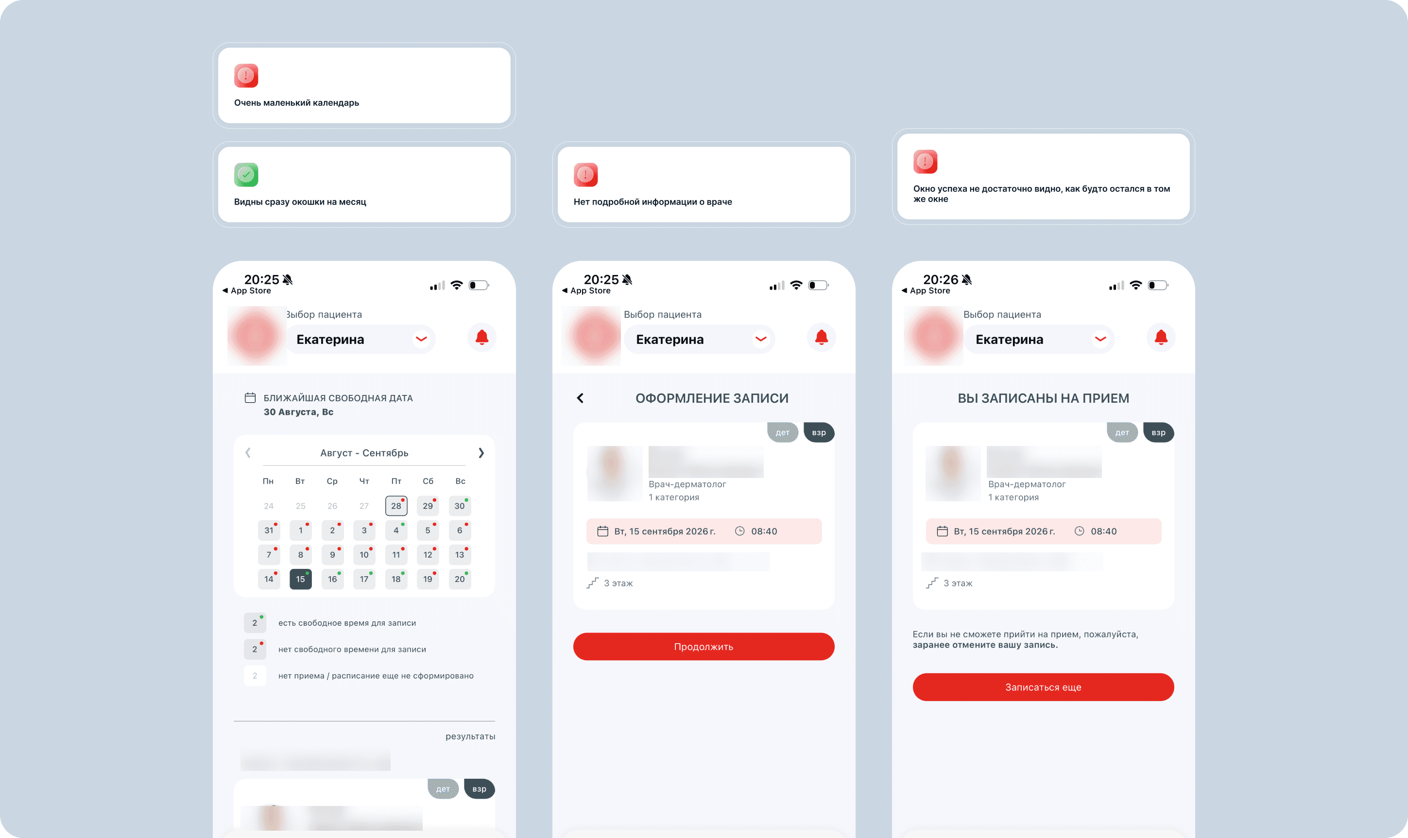
While researching the market, I found a direct contradiction between marketing and legal reality at one of the major players: the website promises “the doctor will create a treatment plan and prescribe medication,” while the fine print at the bottom of the same page says “this information cannot be used for diagnosis or treatment.” Users only learn the service's real limitations after they've already spent time and money.
I decided to design a product that avoids this disappointment — by honestly explaining the format's boundaries before payment, not after.
Users
After analyzing what drives people to use the service, I identified three segments — each with different goals and different legal options available within the same product:
Chronic patient
Under ongoing monitoring for a chronic condition. Functional goal: get a treatment adjustment quickly and more cheaply. Emotional goal: reduce anxiety. Social goal: not seem like a “difficult patient” who bothers the doctor over small things.
Already in treatment
Recently had an in-person visit and is mid-course. Wants to confirm treatment is on track or renew a prescription without wasting time. Afraid of appearing to have abandoned treatment.
One-off visitor
Reaches out irregularly, often to a specific doctor with a specific question. Wants to resolve the issue quickly without taking time off work for a “minor” matter.


JTBD
Core job: “Get a consultation / doctor's appointment without visiting the clinic.”
Chronic patient
Functional: get an adjustment quickly, cheaper
Emotional: reduce anxiety, feel calm
Social: not seem paranoid or like a problem patient who constantly bothers the doctor over minor things
Already in treatment
Functional: get a consultation and renew a prescription quickly; confirm treatment is on track
Emotional: reduce anxiety, feel calm
Social: appear responsible about their health, not like someone who abandoned treatment
One-off visitor
Functional: get a consultation quickly and conveniently, with no lines or traffic, cheaper
Emotional: reduce anxiety, feel calm
Social: avoid taking time off work for a minor issue
Job Stories
Three job stories shaped the core scenario:
|
|
|
Hypothesis Testing
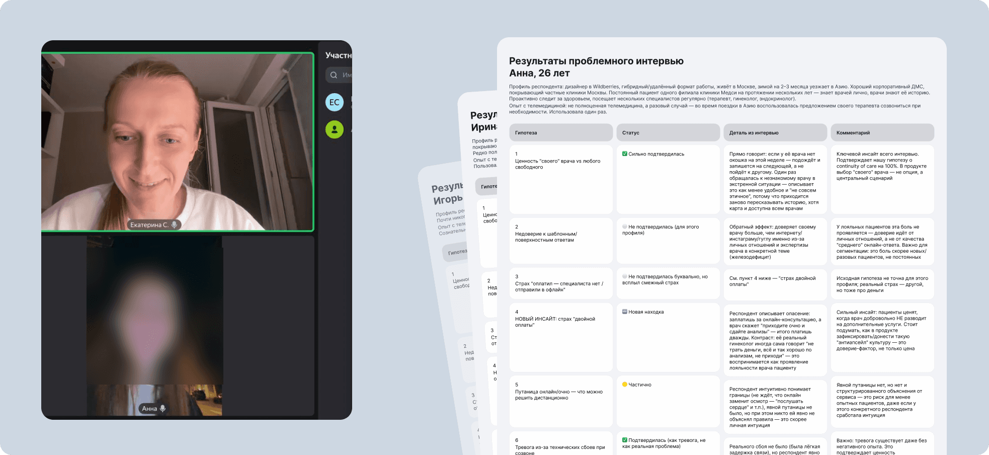
Before designing the solution, I ran problem interviews with patients of a private clinic.
One insight emerged that wasn't in the original hypothesis list: the value of “my own” doctor outweighs speed of booking. Some respondents said outright they'd rather wait a week for their regular physician than see an unfamiliar doctor online today — because they didn't want to re-explain their history or lose the personal relationship with their doctor.
Some initial assumptions weren't confirmed. Meanwhile, anxiety about connection quality turned out to be strong even without any prior bad experience — simply from the uncertainty of “what happens if the call drops.”
Hypotheses & Prioritization
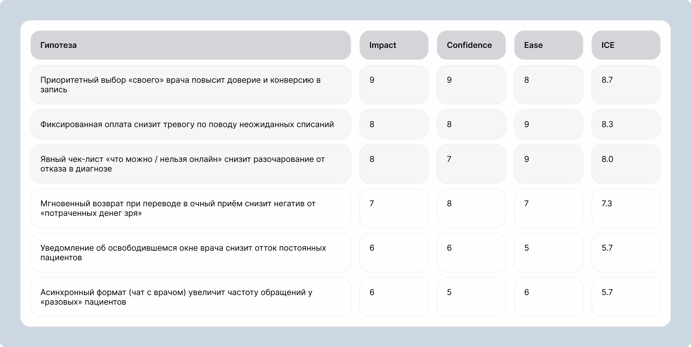
Based on the job stories, competitive analysis, and interviews, I formulated six hypotheses and prioritized them using ICE.
The top three hypotheses formed the MVP — they address the three main, research-validated risk points: loss of trust, financial anxiety, and legal confusion. The rest are candidates for the next iteration.
Solution: Flow
Core user path: “Book an online consultation.”


Solution: Screens
Every screen as an answer to a discovered problem.
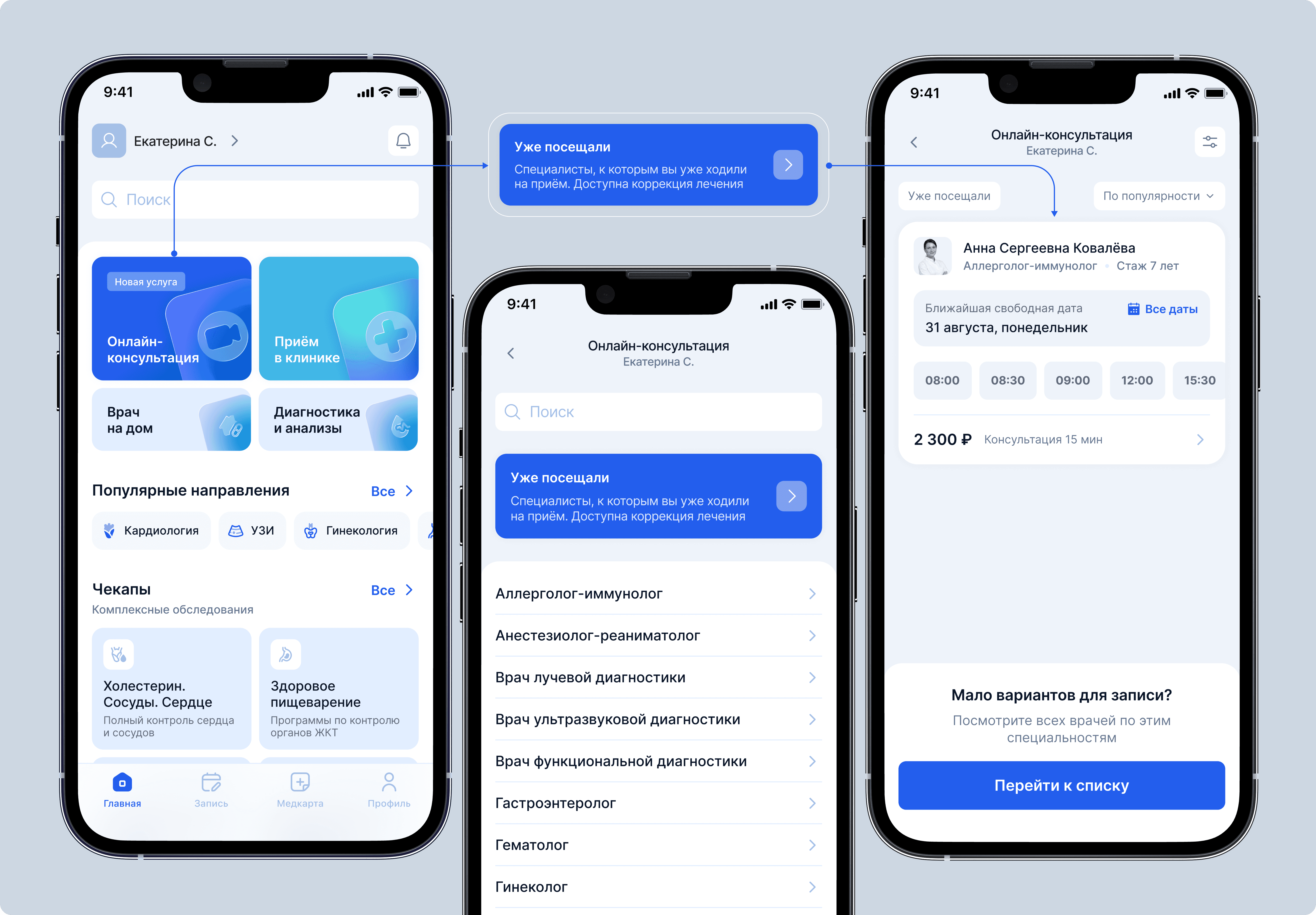
Specialist selection
The “Previously visited” card is the most prominent element in search.
“Important to remember” modal
A list of what's available and what isn't before payment.

Payment screen
Fixed amount.

Results: What Was Done
I analyzed the legal restrictions on telemedicine
I conducted problem-focused interviews with patients at a private clinic
I segmented users into three groups (“Chronic,” “Already in treatment,” and “One-off visitor”) with different functional, emotional, and JTBD and formulated three Job Stories that defined the main scenario.
I formulated six hypotheses and prioritized them using the ICE method; three formed the basis of the MVP
I designed the main user journey, “Schedule an Online Consultation” - from selecting a specialist to payment, "Online Consultation Flow" - from the appointment booking page to the screen confirming the successful completion of the online consultation.
I designed at least 20 screens, complete with UI-kit, all ready for development.


Next Steps
Metrics to validate the MVP
Consultation completion rate (booked → paid → completed)
Repeat booking rate for chronic/already-in-treatment segments
Drop-off rate at the "Important to remember" legal-disclosure screen — a direct signal of whether the honesty-first approach reduces abandonment versus the industry-standard bait-and-switch
Support tickets/complaints tied to unmet expectations about diagnosis or prescriptions
A/B testing the disclosure screen
Since the core hypothesis was that showing legal limitations before payment reduces disappointment, the next stage should test screen placement and wording variants against completion and satisfaction metrics — turning the design bet into a measured result.

