Lumen co. — an online store for designer lighting
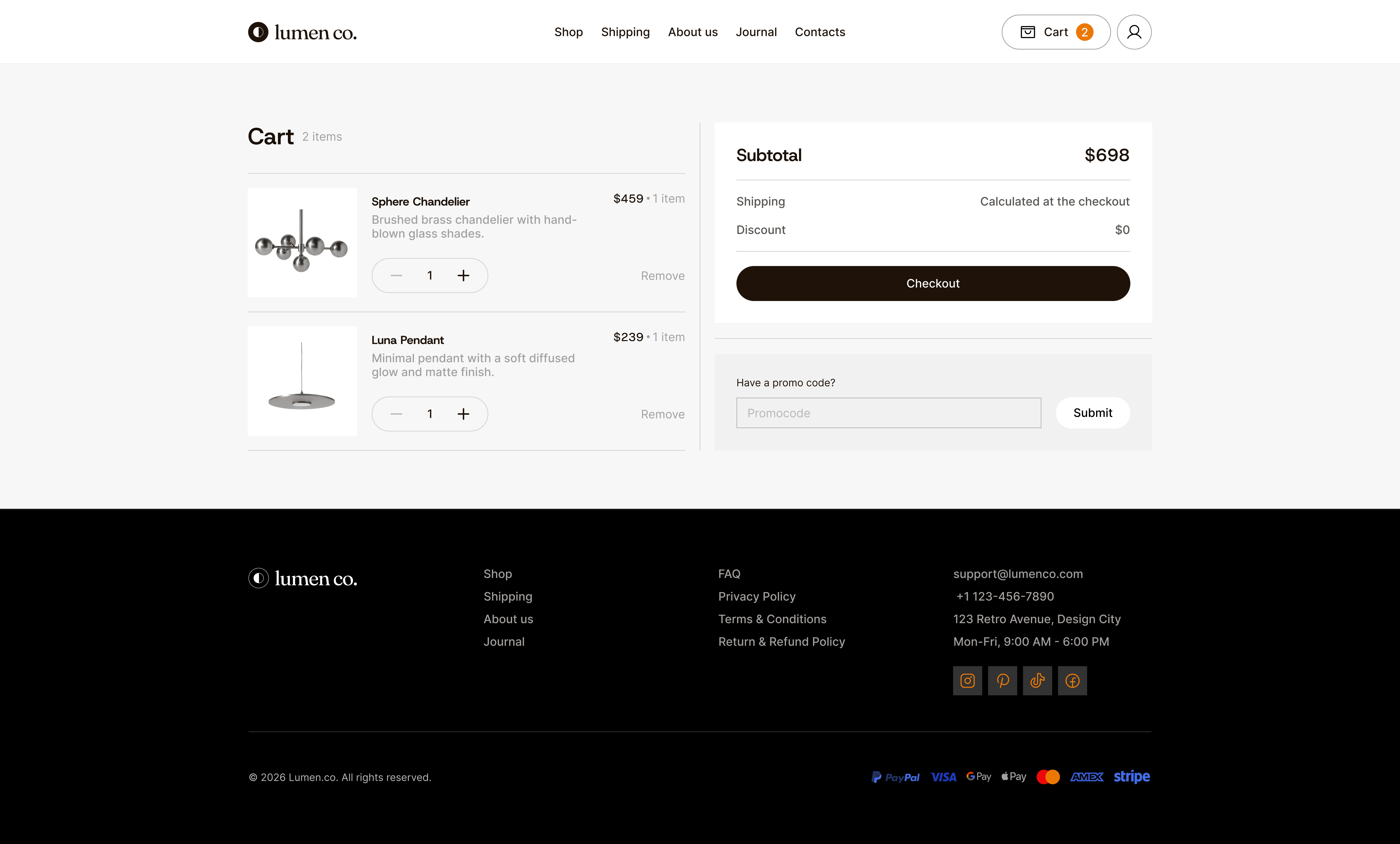
The old site stretched a purchase across at least 8 steps: checkout required an account, products were buried across too many tabs, and adding a lamp to the cart or changing its quantity was only possible on the product page itself. The result. The path is down to 4 steps — registration is out of the funnel, add-to-cart and a quantity stepper moved into the product card.
CLIENT
Concept
segment
B2C
Industry
Ecommerce

Role
Audit of the existing site
User flow
UI refresh and a shorter path to purchase
Problem
Checkout required an account
Registration before payment isn't protection, it's a tax. Someone buying a single lamp isn't ready to create an account.
Dated visual design
The site looked cheaper than the $459 lamp it was selling. That gap between price and presentation costs trust at the most expensive step.
Too many tabs, information got lost
Navigation followed the company's structure instead of the way people choose lighting. Nobody could tell which tab hid the sconces.
No “add to cart” on homepage cards
The homepage worked as a showcase but not as a point of sale. Every product meant a trip to its own page and back.
Quantity could only be changed in the cart or on the product page
People buying lighting often take two or three identical fixtures for one room. The old flow made them repeat the whole loop for each one.
Solutions
1. Purchase flow
Before
At least 8 steps — home → catalog → product → cart → sign up or log in → email confirmation → checkout → payment.

After
4 steps — home → cart → checkout → payment.


2. Navigation cut to five items

3. “Add to cart” on the product card


4. Quantity stepper in the catalog card

5. Checkout without registration

6. Buy Now
For a customer who came for one specific lamp. Buy Now skips the cart and goes straight to checkout